
Graphic Designer
Role
Graphic Design
Branding
Logo Design
Skills
Timeline
1 week
Introduction
This is Flower Sours, a sour beer design study based out of Vancouver, B.C. Flower Sours draws inspiration from the vibrant and free-spirited atmosphere of the 1960s. The era's bold use of colors, psychedelic patterns, and flower power movement serves as the foundation for the compelling design.
Project Goal
The goal in this project was to evoke a sense of nostalgia while celebrating the unique and refreshing nature of sour beers. The target audience for this brand is people 19-30 years old. Sour beers are becoming increasingly popular for this generation because of their refreshing and vibrant taste. I chose a 60’s theme because this era is becoming popular among Gen Z/millennials with its vibrant nature, especially regarding music and fashion.
Logo
For the logo, I chose to do a wordmark. Due to the cans curvilinear shape, it can be placed inside a simple flower graphic or can be effective as a stand-alone graphic. While the typography is experimental, it's also consistent across the Flower Sours brand. The flowy nature of the letters maintains a sense of playfulness, yet the overall consistency ensures that the message is conveyed with clarity.
Packaging
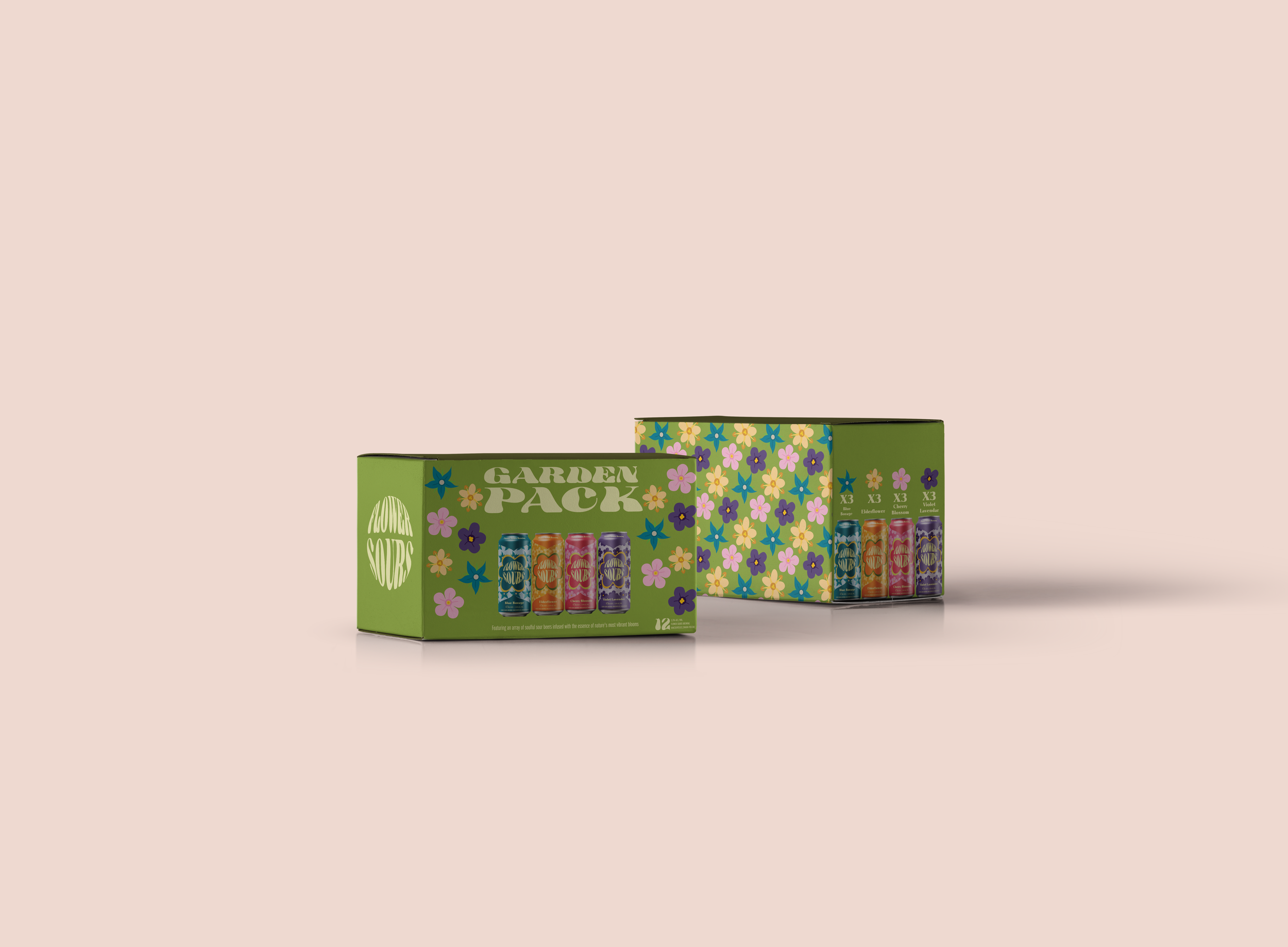
Flower Sours has four unique flavours deriving from natural florals such as “Cherry Blossom”, “ Elderflower”, “Blue Borage” and “Violet Lavender”. Each Flower Sours can design is adorned with a single focal colour that serves as the backdrop for the simple floral pattern. This deliberate choice not only pays homage to the aesthetics of the 1960s but also allows consumers to distinguish between the flavors at a glance visually.


Collateral
To bring the Flower Sours brand to life beyond the bottle, I designed a range of playful and eye-catching collateral. Branded coasters, tote bags, and hats extend the visual identity into everyday touchpoints, reinforcing the beer’s fun, floral personality.


Outcomes
Through this project, I gained a deeper understanding of how to create harmonious designs using a limited color palette. Experimenting with monochromatic schemes allowed me to explore the subtleties of color variation. Working with a single color forced me to consider the role of contrast in design. I learned how to use variations in tone, texture, and scale to create visual interest and hierarchy within the composition, ensuring that important elements stand out without the need for additional colors.