
Role
Graphic Designer
Graphic Design
Branding
Logo Design
Skills
Timeline
12 weeks
Introduction
As part of a complete rebrand for Quesnel Septic, Pure Stream was created to reflect a more eco-conscious, modern approach to wastewater solutions. The goal was to move away from outdated industry visuals and language, and instead present a fresh, trustworthy, and environmentally responsible identity. From the name and logo to typography and color palette, every element was designed to communicate cleanliness, reliability, and sustainability, helping the business stand out in a traditionally overlooked sector.
Project Goal
The goal of the PureStream rebrand was to align the company with principles of environmental stewardship and responsible waste management. By modernizing its visual identity and messaging, PureStream aims to minimize its ecological footprint while continuing to provide essential septic and wastewater services to both residential and industrial clients.
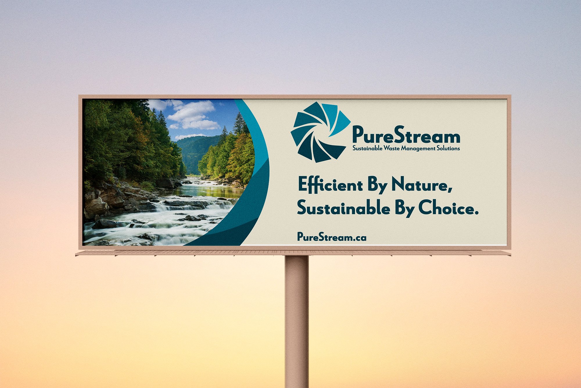
Logo
The logo centers around a circular, swirling motion inspired by the natural flow of water This dynamic shape represents both purification and continuous flow, essential to septic and wastewater systems. The three-shade blue palette reinforces a sense of clarity and cleanliness while keeping the tone professional and approachable.
The term "stream" evokes imagery of continuous flow, signifying fluidity and efficiency in their processes, while "pure" underscores their commitment to quality and excellence.
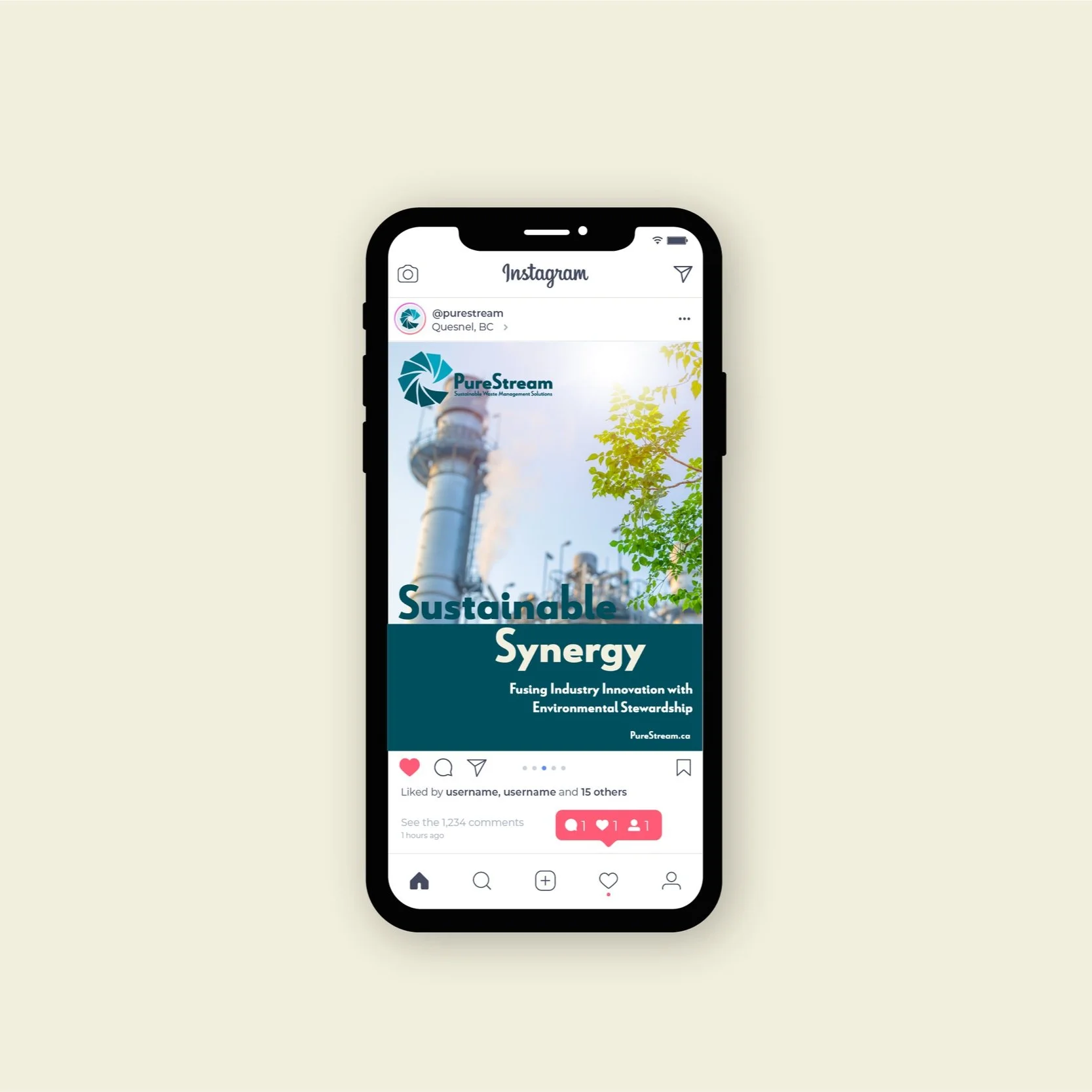
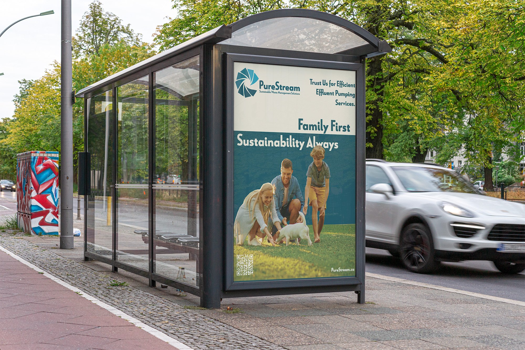
Ad Campaign
The adcampaign targets two key audiences with tailored messaging. For industrial clients like pulp and sawmills, the focus is on showcasing how PureStream’s advanced technologies support operational efficiency and environmental responsibility. Clean, professional visuals and messaging emphasize that industry and sustainability can work together.
For young homeowners in Quesnel, the campaign takes a more personal approach, highlighting PureStream’s role in protecting family health and the environment. Featuring images of modern, eco-conscious lifestyles, the ad appeals to homeowners who value sustainability and want reliable, responsible waste management for their property.


Website
For PureStream's landing page, the overarching theme revolves around the fusion of sustainability and efficiency, catering to both industrial clients and young homeowners alike. The page serves as a gateway to showcase PureStream's comprehensive solutions, emphasizing the company's commitment to environmental stewardship while addressing the unique needs of diverse clientele.


Brand Collateral
To bring the PureStream brand into the real world, I designed a cohesive set of branded touchpoints—from service vehicles and uniforms to hard hats and equipment. Each application reinforces the clean, circular logo and calming blue palette, creating a professional and trustworthy look across all customer-facing materials. This consistent visual identity helps build recognition, trust, and credibility whether the team is on-site, on the road, or in the shop.


Outcomes
Through the process of rebranding PureStream, I discovered the transformative potential of turning negative perceptions associated with the waste management industry into positive connotations. By carefully crafting the brand's identity and messaging, I learned how to reshape public perceptions and position PureStream as a beacon of sustainability, innovation, and environmental responsibility.